UX writing & content strategy
UNICEF at UGA
Rebuilding a student organization's public website from a confusing, dead-end brochure into a living recruitment tool through information architecture, plain-language content, and a modern visual identity.
For an incoming freshman searching for the club, this website was the first impression.
The UNICEF at UGA site was the chapter's most public platform, yet its outdated design and fragmented navigation left prospective members frustrated and under-informed. When new executives sat down to improve recruitment, the website was the obvious place to start.
The redesign is live
The rebuilt site is the chapter's active public platform today. Everything below is drawn from the real before and after.
The problem
A heuristic audit (clicking every link and mapping every flow) surfaced three critical failures.
- Fragmented information architecture. Core concepts lived on separate pages: a visitor had to hop between "What is UNICEF?" and "Our Mission" just to grasp the chapter's basic purpose.
- A dead-end Events page. The events page carried a single line telling visitors to stay tuned for next year, and nothing else. No past events, no proof the club was active.
- Weak content hierarchy. The most recruitment-relevant content, like Meet the Board and Our Focus Areas, sat at the bottom of a long home page, disconnected from the mission it supported.
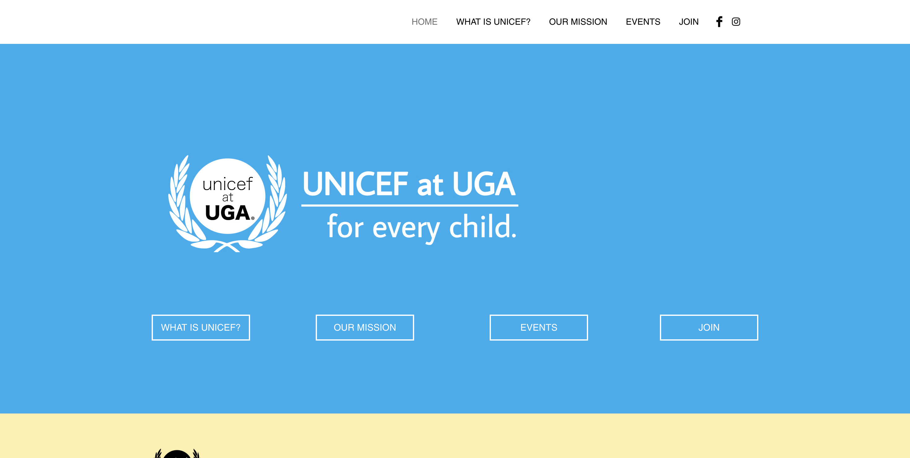
The old home page pushed visitors straight back out to four separate pages instead of answering anything itself.
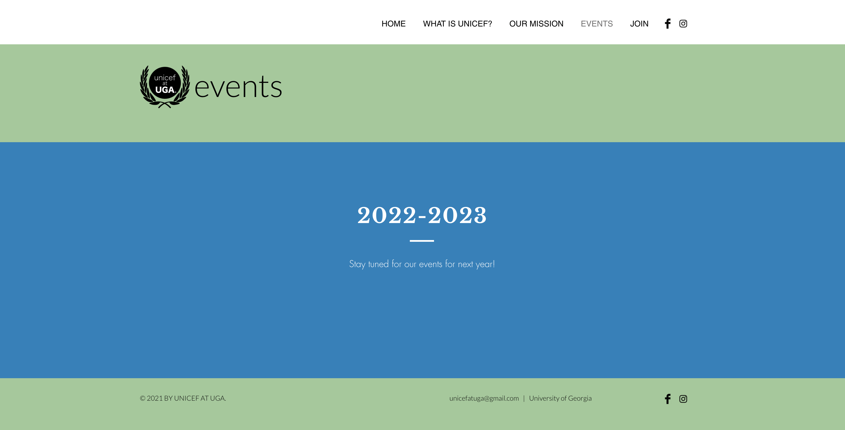
The Events page: a heading, one line of deferral, and nothing to act on.
A site that tells you to come back later is telling you the club isn't doing anything.
The insight that reframed the projectObjectives
- Simplify navigation. Restructure the information architecture into a logical, intuitive flow.
- Modernize the visuals. Establish a professional, cohesive identity aligned with the global UNICEF brand.
- Drive engagement. Create clear pathways toward the goals that matter.
Audit — discovering the "why"
Rather than judging the surface, I ran a deep-dive heuristic analysis: every link clicked, every user flow mapped, every UX and UI pain point logged against the experience a new visitor would actually have.
Define — simplifying the journey
The root cause was the IA. My key strategic decision was to consolidate the fragmented "What is UNICEF?" and "Our Mission" content into one story-driven pageso a newcomer could understand the chapter in a single scroll.
Design — building a visual identity
I created a cohesive colour palette drawn from the global UNICEF brand, updated the typography for a more professional tone, and designed reusable components, such as buttons, info cards, footers, for consistency across the whole site.
Restructuring the architecture
Five top-level destinations became four, and the pages a newcomer needed most were merged into one narrative. The old "What is UNICEF?" address still resolves. It simply lands on the consolidated page now, so nothing that had already been shared or linked was broken.

"What is UNICEF?" explained the global organization…
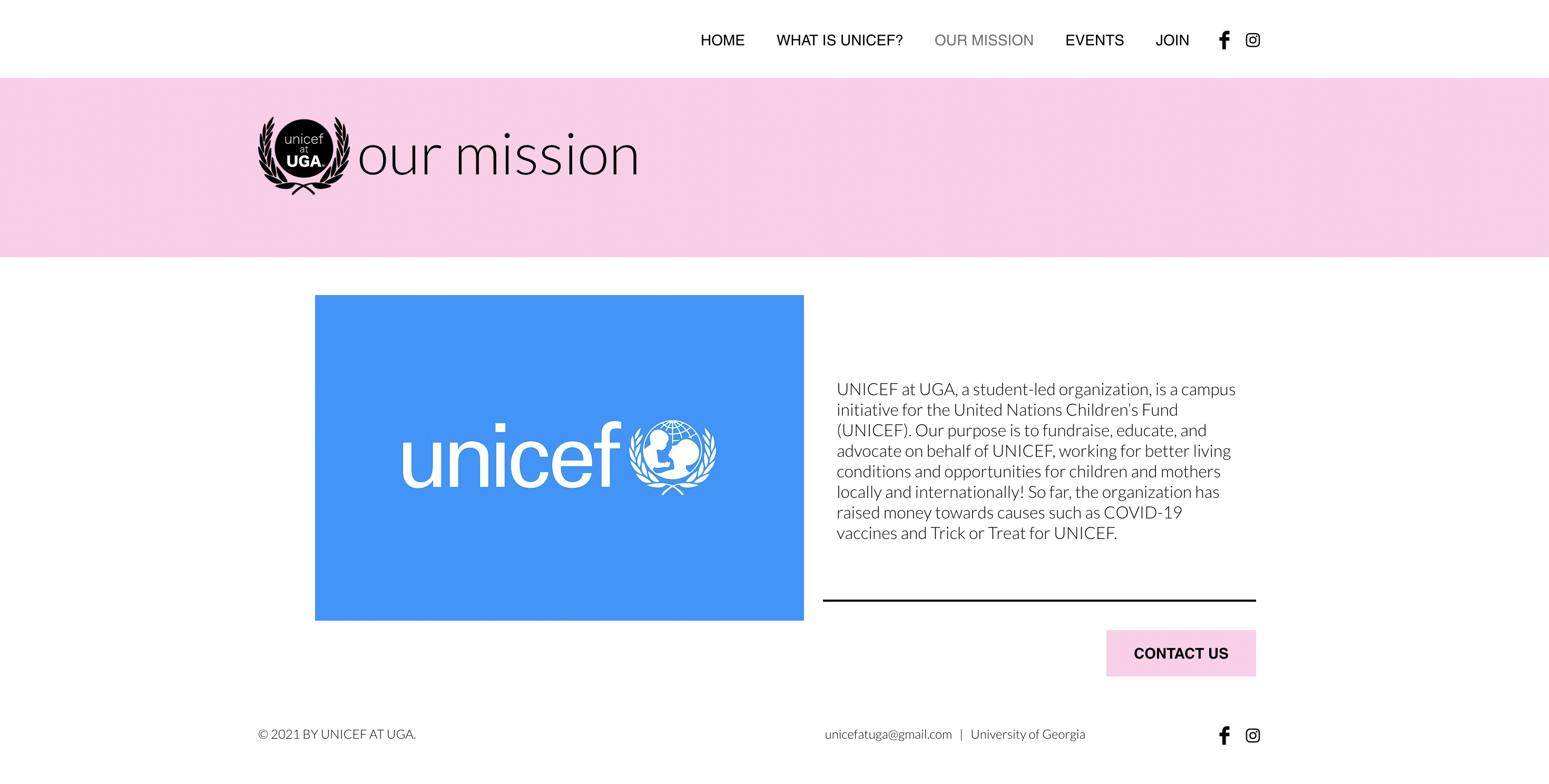
…while "Our Mission" explained the chapter. Neither made sense without the other.
Before · 5 destinations
After · 4 destinations

The rebuilt home page, with navigation consolidated to four clear destinations.

Events is now portrayed through a live Instagram feed, where events are posted anyway, to make it easy on executive board.
Rewriting the content
The structural fix only worked if the words did too. Two rewrites did the heavy lifting.
That last decision mattered most. The original page died because keeping it alive was somebody's manual chore. Wiring it to the feed the officers already post to means the site stays current whether or not anyone remembers to update it, designing for maintenance, not just for launch.
Outcome
The rebuilt site brought more people in. It remains the chapter's live public platform.
Reflection
This project reframed content strategy for me as a structural discipline, not a cosmetic one. The biggest win wasdeleting the friction between a curious student and a simple answer. Consolidating the intro pages into one story did more for the experience than any single visual change.
If I ran it again, I'd instrument it better from the start. I have the traffic lift, but I'd want to know which path people take to the Join page, the number that would tell me whether the new architecture is really doing its job.